UI/UX

Redesigning the Net Promoter Score Component

Redesigning Ajua’s Net Promoter Score component to let their clients easily understand the loyalty of their customers.

January 12, 2022

This is part of a series where I share my thoughts about how small design changes can significantly impact an app’s overall design and user experience.

Ajua provides tools that allow companies to get deeper insights into their customers. One of these tools lets companies know their Net Promoter Score.

The Net Promoter Score (NPS) is a metric used in customer experience programs, and itmeasures the loyalty of customers to a company.

After redesigning their login page, the next quick redesign I wanted to tackle that would have a significant impact on the app was the NPS summary component on the dashboard.
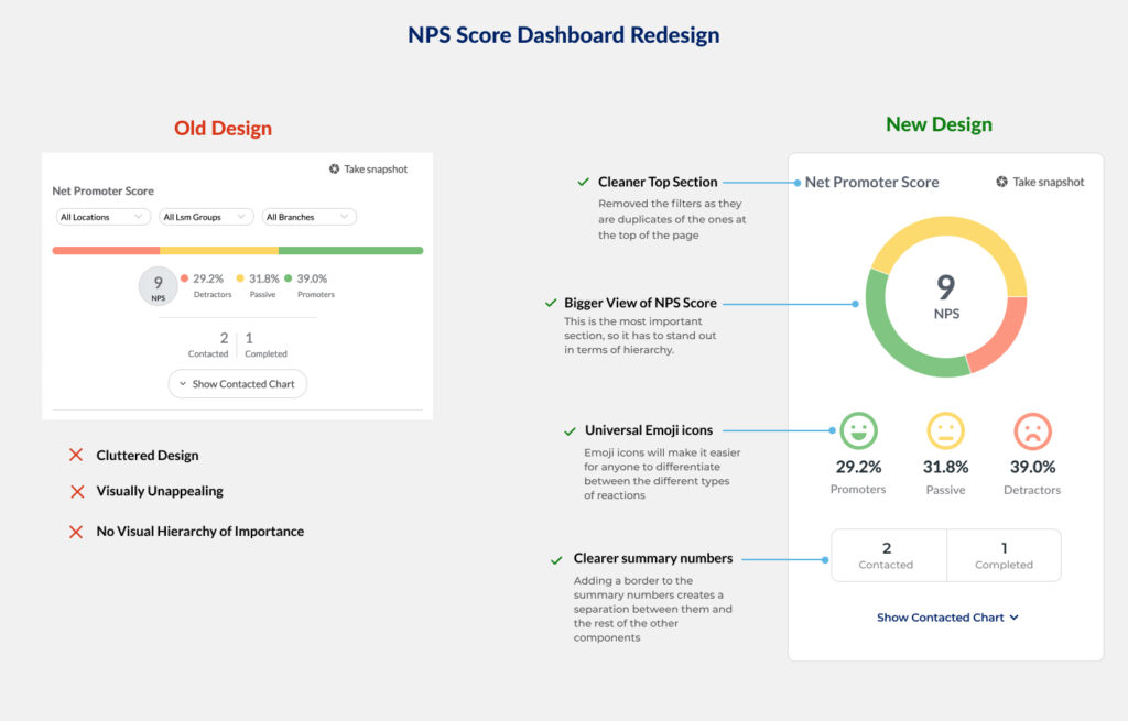
Old design

The old NPS component had some of these problems:

  • Cluttered Design. The component had too many elements making it confusing.s in a single component.
  • Visually unappealing. The old design did not pull the user’s attention or stick out, yet it was the most important component on the page. The score is what many of Ajua’s clients were interested in seeing.
  • No visual Hierarchy. Nothing stood out in terms of importance. This meant a user had to spend a few moments figuring out what their NPS was.

New design

  • Cleaned up the top section. I removed the top filters of the component as they were duplicates of the ones at the top of the page.
  • Larger NPS. The score is the most important element of the whole component, so I had to make it stand out in terms of hierarchy.
  • Use of Emojis. In the world we live in, most people understand emojis, and if used correctly, they can be as effective as words while communicating. With that in mind, I used emojis to better convey the feelings of customers towards a business. After all, that is the purpose of NPS.
  • Clearer summary of numbers. Adding a border to the summary numbers creates a separation between them and the rest of the other components, thereby making them clearer to understand.

Final Thoughts

A minor redesign can significantly impact how certain data is presented on a page. In the case of Ajua’s NPS component, it made it easier for their clients to quickly log in and see how their customers are feeling about their business.

Designing a More Effective Login Page

Login pages can be more than just input fields and a button. With a few additional changes, they can be an effective way to communicate with your users.

December 17, 2021

This is part of a series where I share my thoughts about how small design changes can significantly impact an app’s overall design and user experience.

Recently, Ajua hired me to help redesign their app to improve its user interface and user experience.

While going through it with the team, I realized that it would take a couple of months to redesign the app entirely.

This was a problem as Ajua is a fast-moving company that uses the agile methodology to build its services. This meant that they continually added new features and improvements that required my input as a designer making it challenging to focus on a complete redesign.

I decided to take full advantage of their agile methodology to get around this. My plan was simple: Redesign or improve the design or UX of a component every two weeks in time for the next deployment to production.

Redesigning the login page

The first task I wanted to tackle was the login page, as it is the first point of entry into the app. I wanted it to be more than just two input fields.

I am a big fan of using images to make apps friendlier. My initial thought was to use a single image and perhaps have a simple message about the Ajua app.

But the more I thought about it, the more I realized we could do so much more. We could change the images dynamically and share special messages during holidays, updates on upcoming or recently released features, or whatever we decide on.

Once I presented my ideas and prototypes to the engineering team, we set about to build a dynamic login page. We added the container on the left side to dynamically add an image, a title, and a description.

Here is how the old login page looked liked.

Here is how the login page would look during the holidays using a sample image and message.

New login Screen

I could not redesign the login page without redesigning the forgot password page. For the redesign, I decided to keep it simple.

Here is how the old forgot password page looked like.

Old Forgot password screenshot

Here is how the new forgot password page looks like

New forgot password screenshot

Conclusion

Product designers tend to want to tackle the big challenges and redesigns, but sometimes small design tweaks/changes can considerably impact the UI/UX of an app.