This is part of a series where I share my thoughts about how small design changes can significantly impact an app’s overall design and user experience.
Ajua provides tools that allow companies to get deeper insights into their customers. One of these tools lets companies know their Net Promoter Score.
The Net Promoter Score (NPS) is a metric used in customer experience programs, and itmeasures the loyalty of customers to a company.
After redesigning their login page, the next quick redesign I wanted to tackle that would have a significant impact on the app was the NPS summary component on the dashboard.
Old design
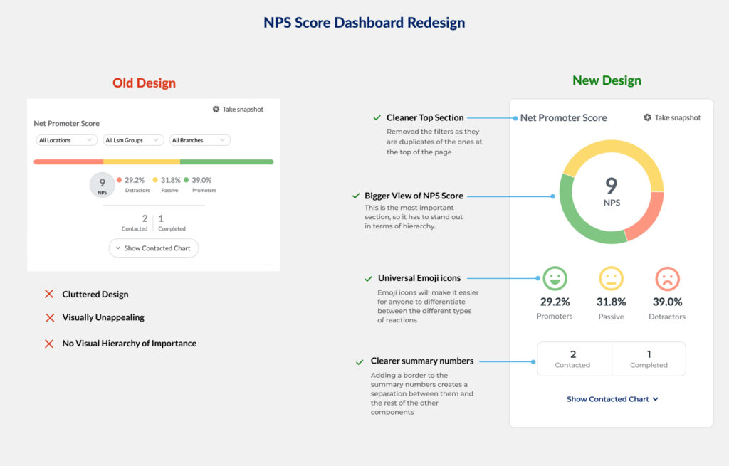
The old NPS component had some of these problems:
- Cluttered Design. The component had too many elements making it confusing.s in a single component.
- Visually unappealing. The old design did not pull the user’s attention or stick out, yet it was the most important component on the page. The score is what many of Ajua’s clients were interested in seeing.
- No visual Hierarchy. Nothing stood out in terms of importance. This meant a user had to spend a few moments figuring out what their NPS was.
New design
- Cleaned up the top section. I removed the top filters of the component as they were duplicates of the ones at the top of the page.
- Larger NPS. The score is the most important element of the whole component, so I had to make it stand out in terms of hierarchy.
- Use of Emojis. In the world we live in, most people understand emojis, and if used correctly, they can be as effective as words while communicating. With that in mind, I used emojis to better convey the feelings of customers towards a business. After all, that is the purpose of NPS.
- Clearer summary of numbers. Adding a border to the summary numbers creates a separation between them and the rest of the other components, thereby making them clearer to understand.

Final Thoughts
A minor redesign can significantly impact how certain data is presented on a page. In the case of Ajua’s NPS component, it made it easier for their clients to quickly log in and see how their customers are feeling about their business.
