Designing Moja Lami – an Advertising Platform for the Moja Network
BRCK was looking to expand its client base by creating a platform that enables advertisers to create, monitor, and analyze the performance of their campaigns on the Moja Network.
The Challenge
For a business to advertise on the Moja platform, they had to contact the sales team. Once an agreement was reached, they would send over their assets and information, and a member from the content team would then create the campaign. This was not scalable.
To solve this, we set out to achieve these two main business goals:
- Create a scalable platform that advertisers would use to create their campaigns on Moja.
- Enable advertisers to view data on the performance of each individual campaign easily.
My Role
I led the product team that built the platform.
I was also responsible for Interaction Design, Visual Design, Prototyping & Testing, User Experience, and the creation of the HTML templates for the software engineering team.
Rethinking the Experience
After the feedback, we went back to the drawing board. One thing that had become exceedingly clear was that we had to make Moja Lami so simple that even the non-tech-savvy business owners could use it.
To achieve this, I came up with these additional goals:
- Create a user experience that felt friendly and approachable, making it easier for our non-tech-savvy users to feel comfortable using the platform.
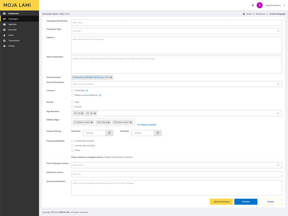
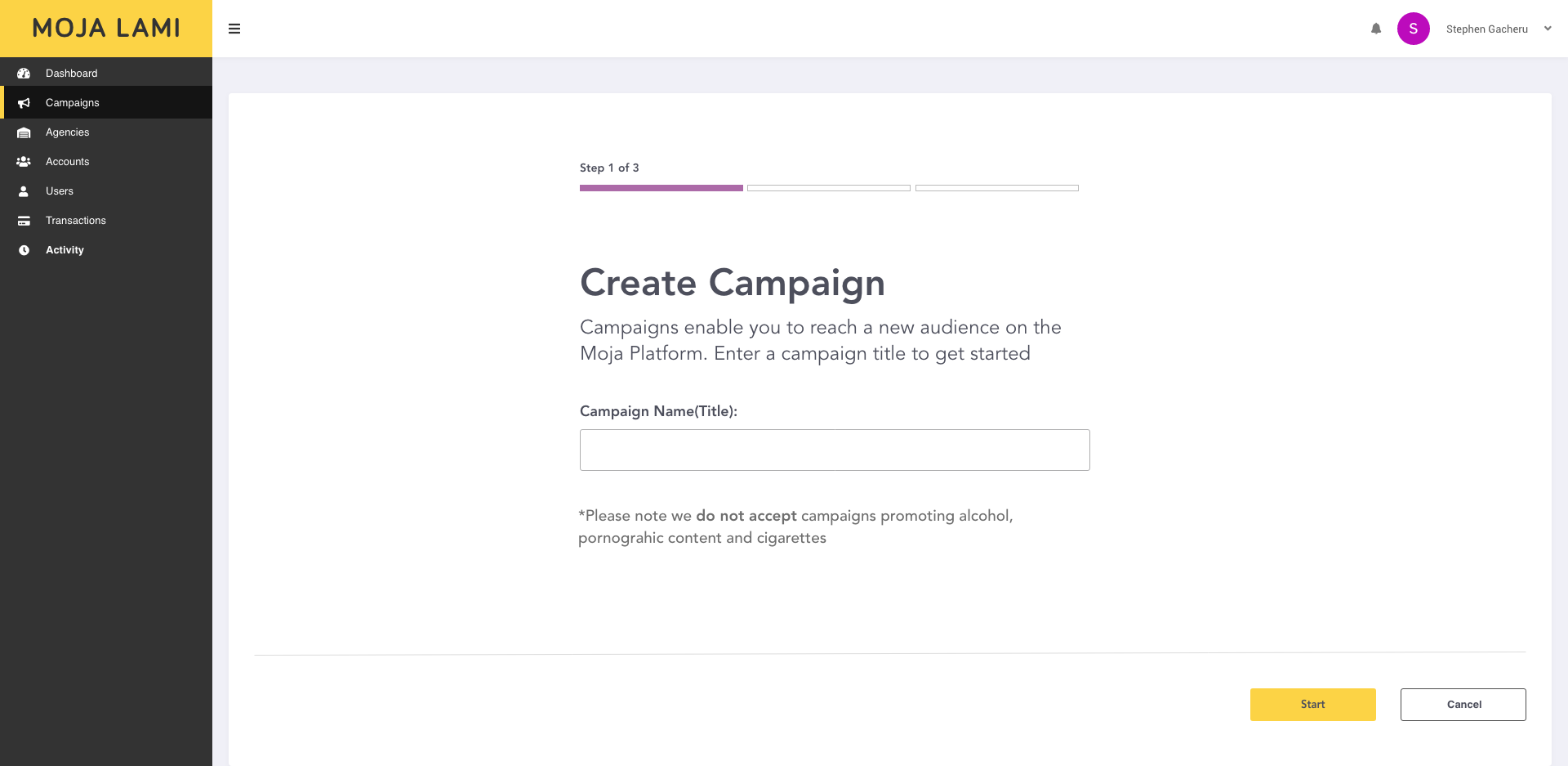
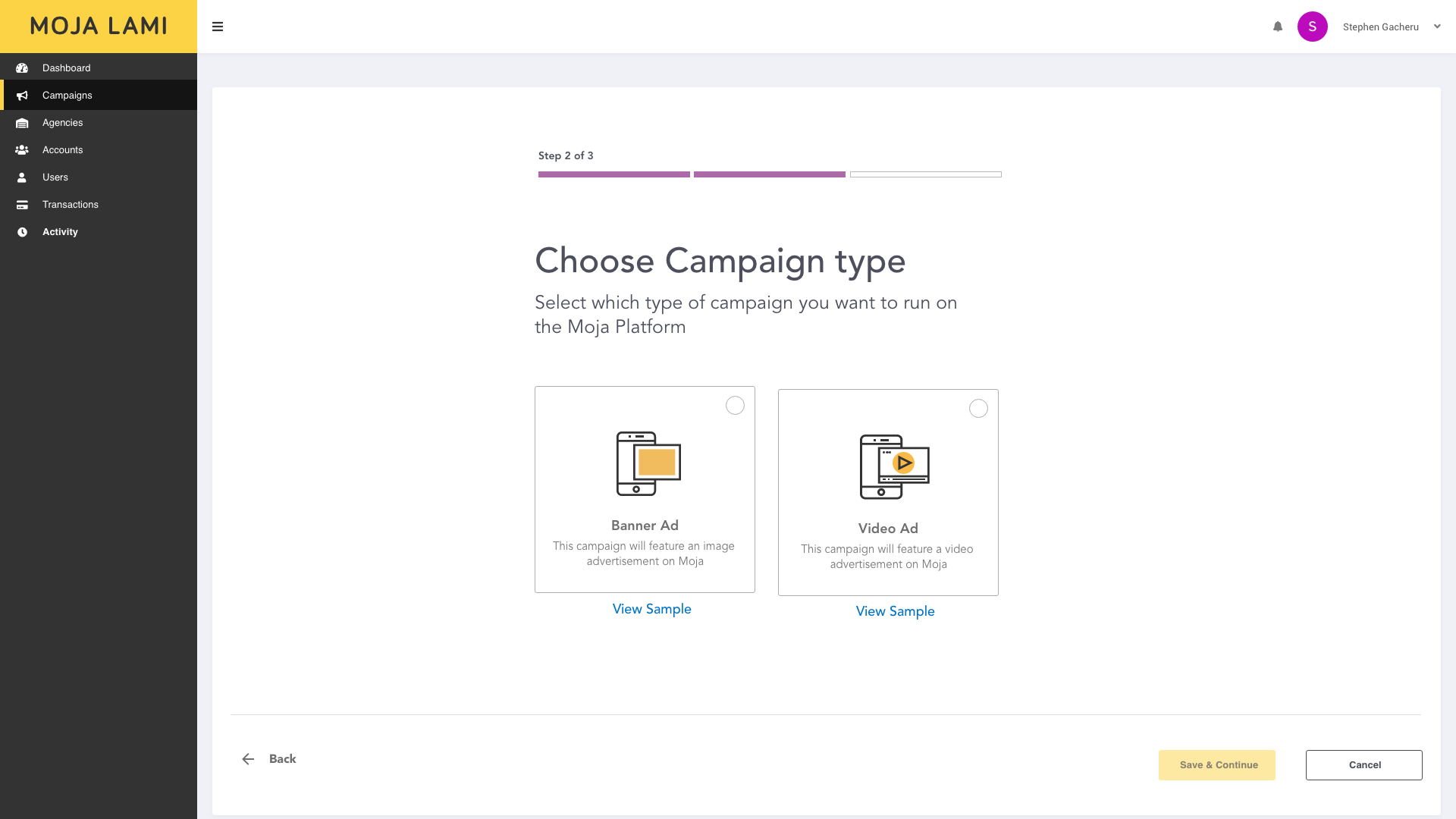
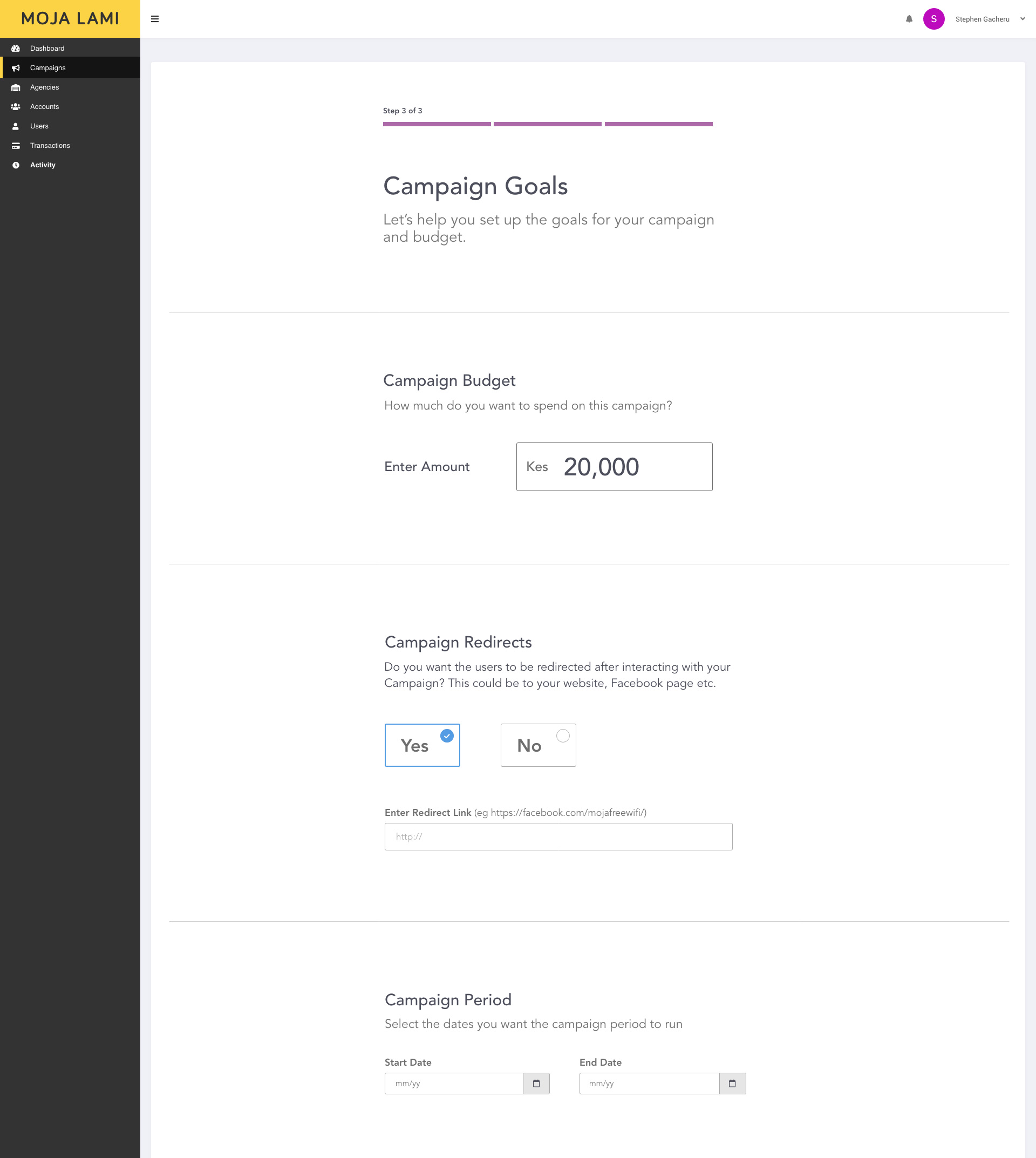
- Remove all unnecessary fields or steps that make it harder for our users to create a campaign.
- Present data so simply that anyone can easily interpret it.
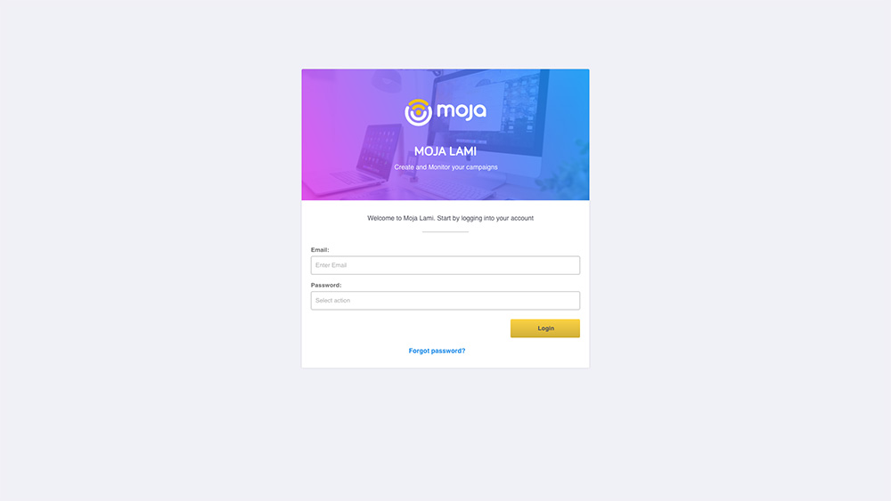
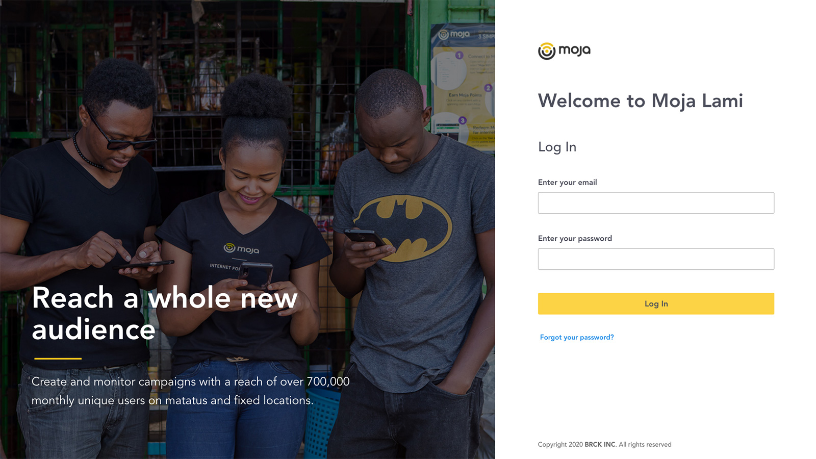
A Friendlier Login Page
To set the friendly and approachable theme, it was important to put a human aspect right at the gateway to the platform. Also, we wanted to communicate the potential reach of a campaign to encourage users to create one.
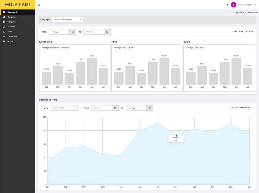
New Dashboard
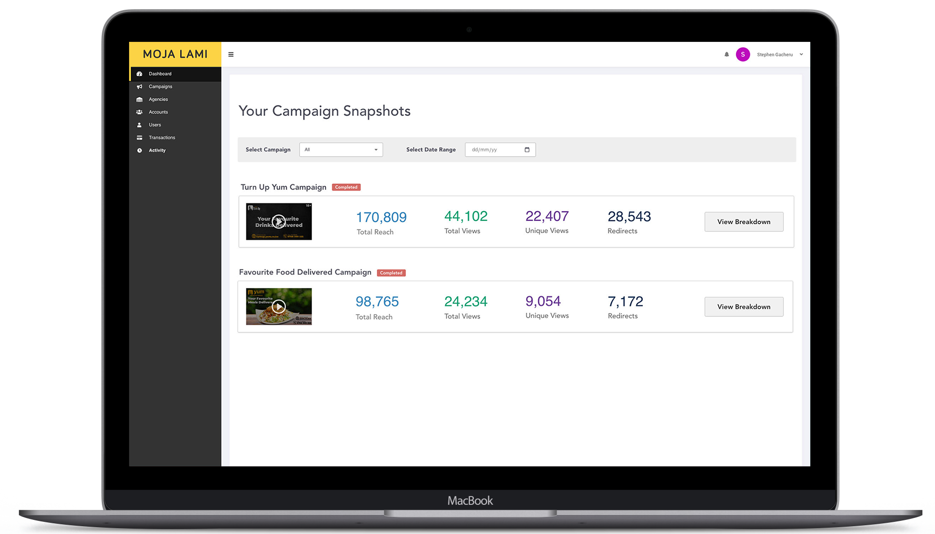
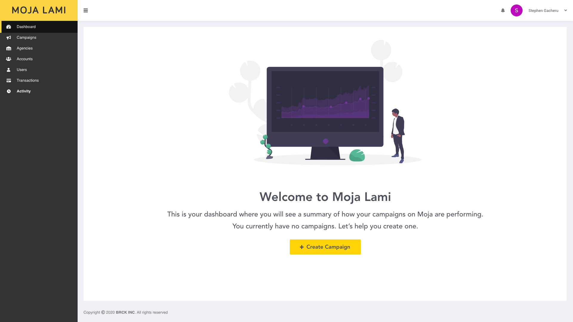
When logging in for the first time, I wanted users to see a welcome message, an explanation of what to expect once they have a campaign running, and a call to create one.
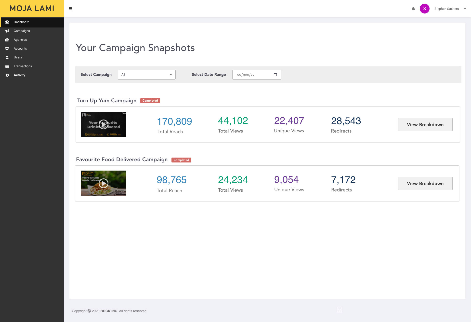
For the dashboard redesign, we had multiple iterations and feedback. We settled on the one that provided a quick summary of the performance of each campaign and a link to further breakdown. This made it easier for users to view how their campaigns were performing.
I also added thumbnails showing the main campaign asset to make it easier for users with multiple campaigns to remember which campaign they are looking at.
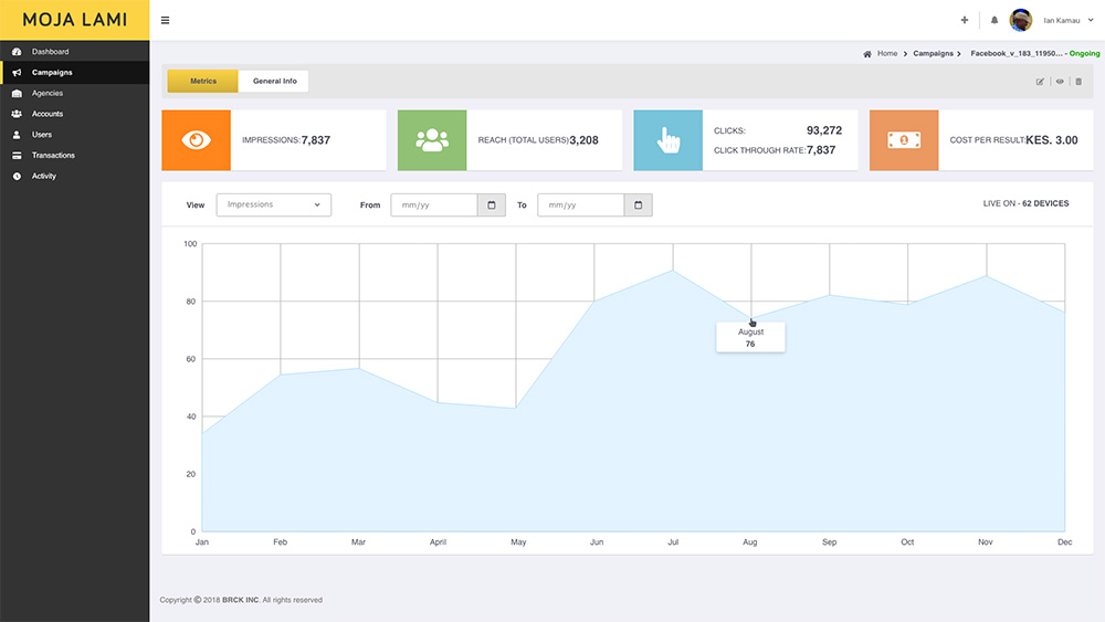
Detailed Campaign Insights
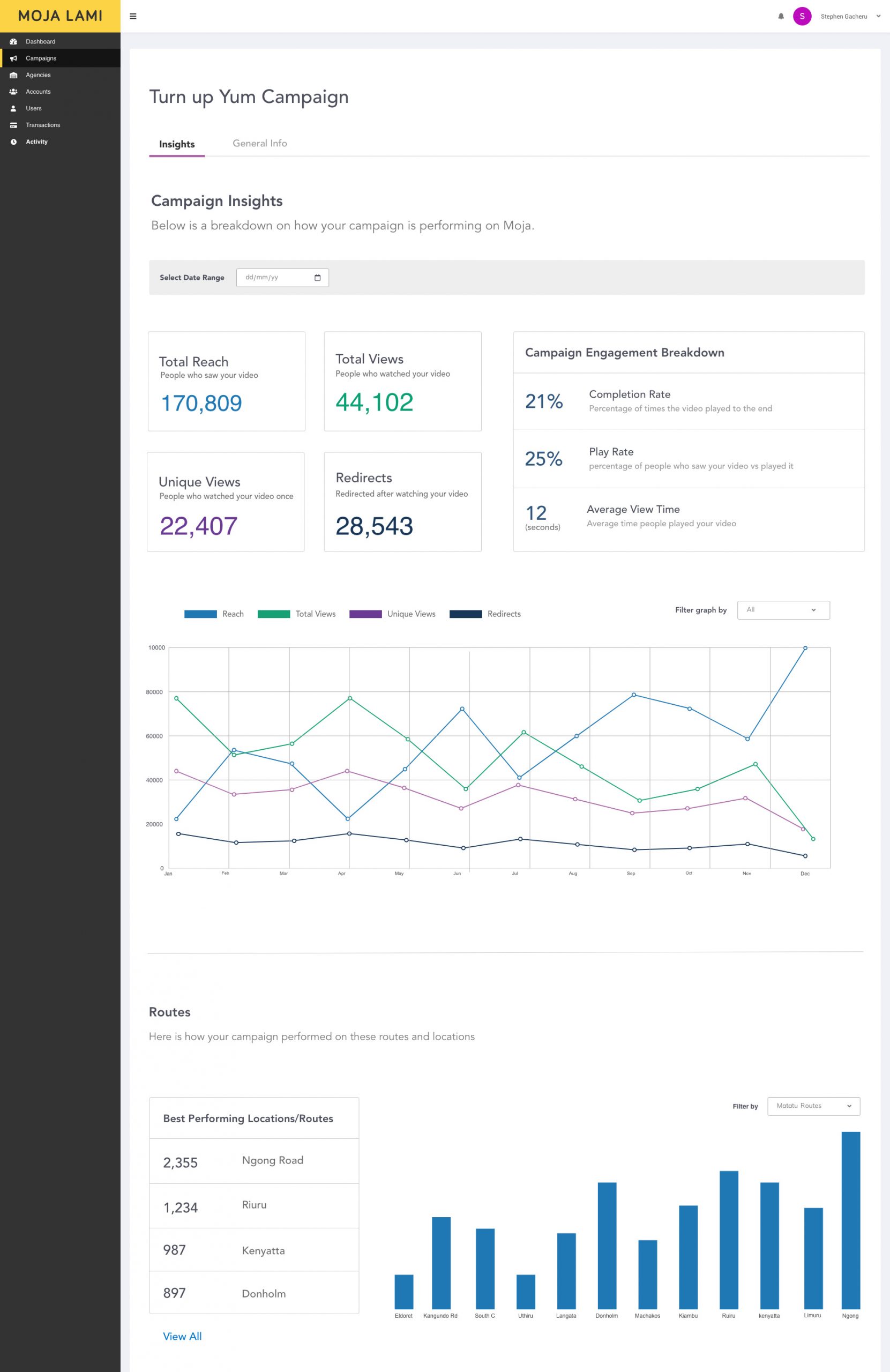
The goal for the campaign insights page was to provide a breakdown of different metrics that would cater to users who would be only interested in numbers and those who like to see their data presented in graphs
It was also important to provide simple explanations to the various breakdowns for non-tech savvy users who would not know to click an icon to reveal a detailed explanation of some of the terms.
Conclusion
Some of the feedback we received from users were they loved the new minimal look and simplicity of use. One user remarked, “This is the easiest campaign creation process I have ever seen.”
However, because of the Covid-19 pandemic and change of priorities, we could not continue developing Moja Lami and roll it out to a larger audience.
To that end, I am incredibly proud of my team and the larger business team that did everything they could to help bring the Moja Lami vision to life.

