Redesigning the Moja Network UI
BRCK wanted to introduce Moja points into the Moja ecosystem. For this to happen, a redesign of the UI was needed.
Introduction
Moja is BRCK’s free public WiFi network that was set up in matatus (public transport) and selected fixed locations. It enabled anyone within range of the signal to connect to the internet and access Moja’s stored content to watch shows, listen to music, or read books.
BRCK’s unique business model is set up to make revenue from business customers and instead have users earn their internet with time and engagement, not money.
To streamline operations and increase revenue, BRCK introduced points into the Moja ecosystem. Businesses would purchase these Moja points in exchange for digital engagements that ran on the platform.
The Challenge
To introduce this new change, Moja needed a redesign. This redesign would have to achieve the following goals:
- Build for mobile because 99% of our users accessed Moja via their phones.
- Make it easy for users to earn points starting from the onboarding stage.
- Present plenty of options for users to earn points because most users will use their points to browse online.
- Present Moja stored content beautifully to increase engagement.
My Role
My initial role was to create the HTML/CSS templates based on the UI designs and hand them over to the engineering team.
After leading the product team in the business department, I shifted focus to wireframing, prototyping, and creating the final visual designs of the business features on Moja.
The Redesign
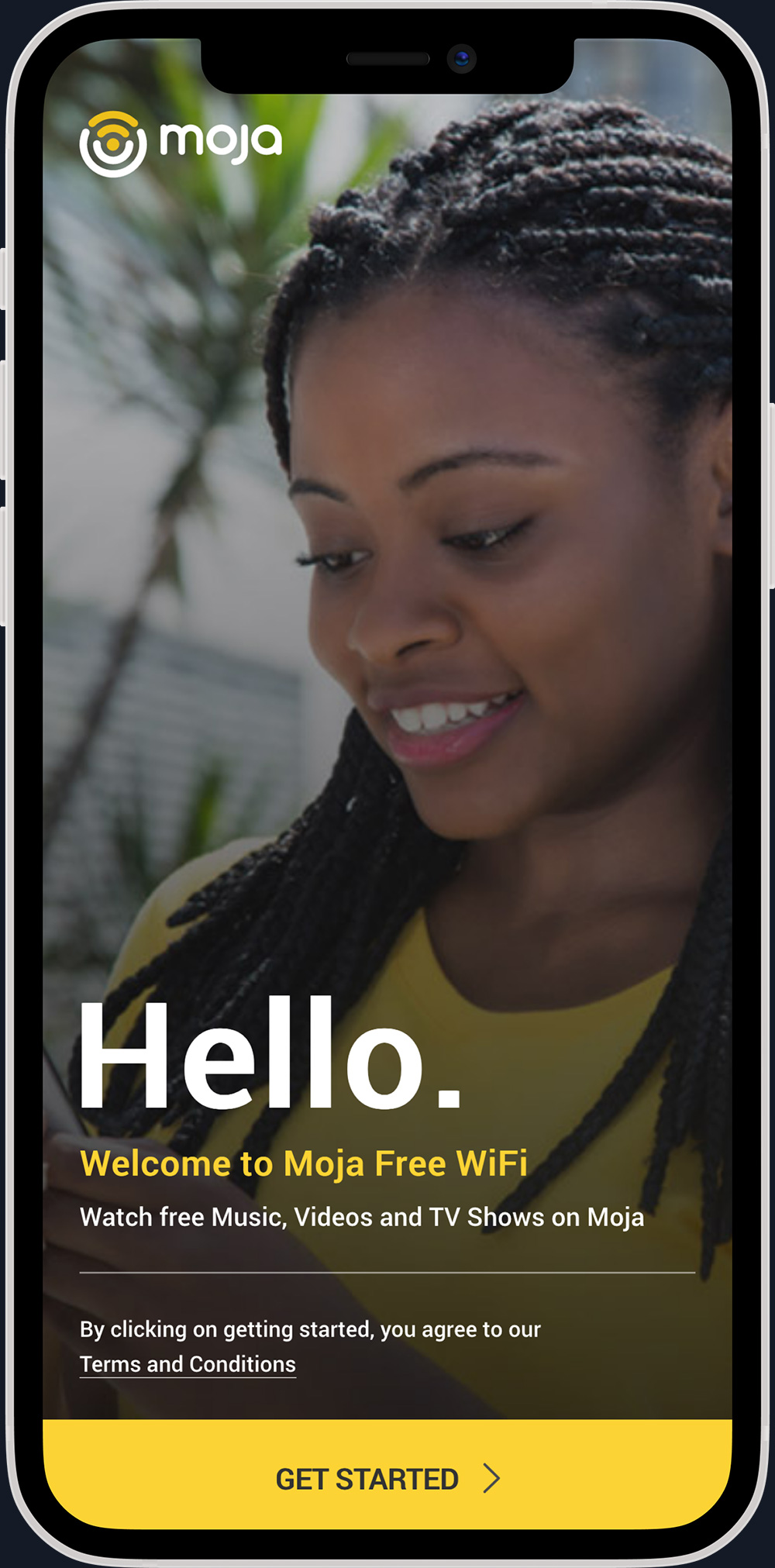
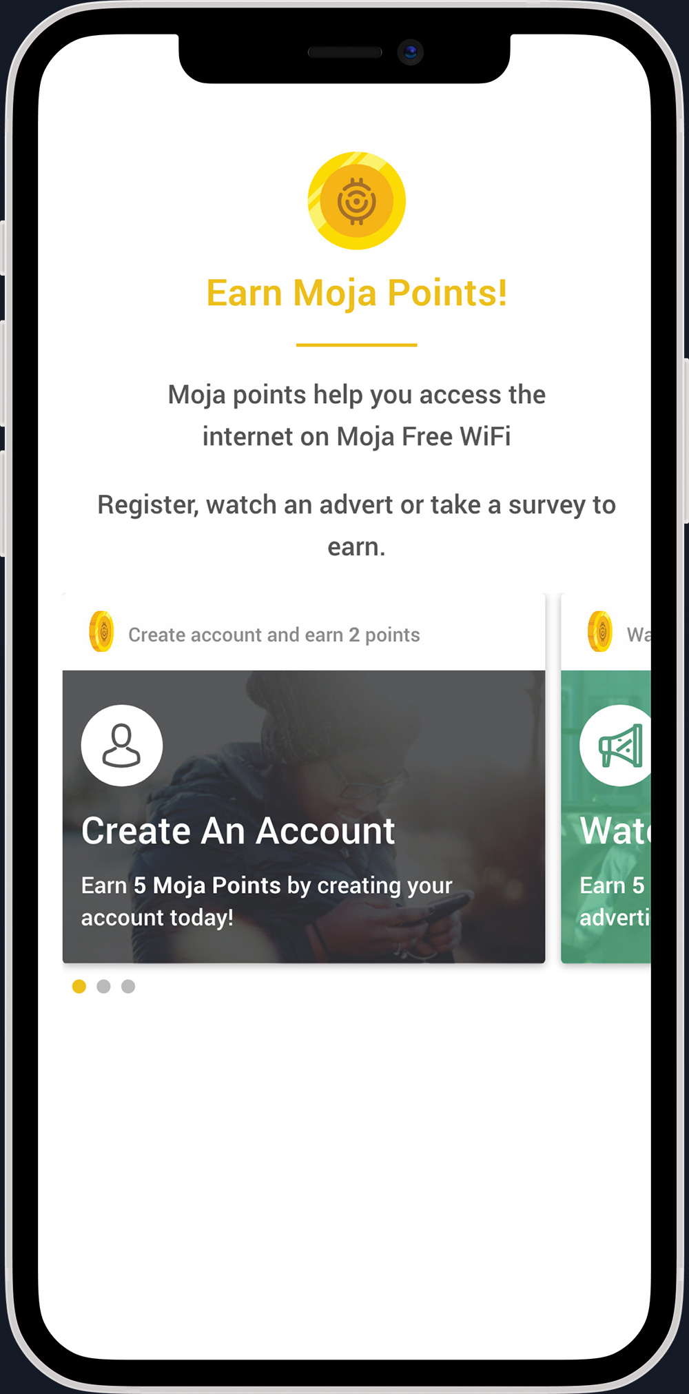
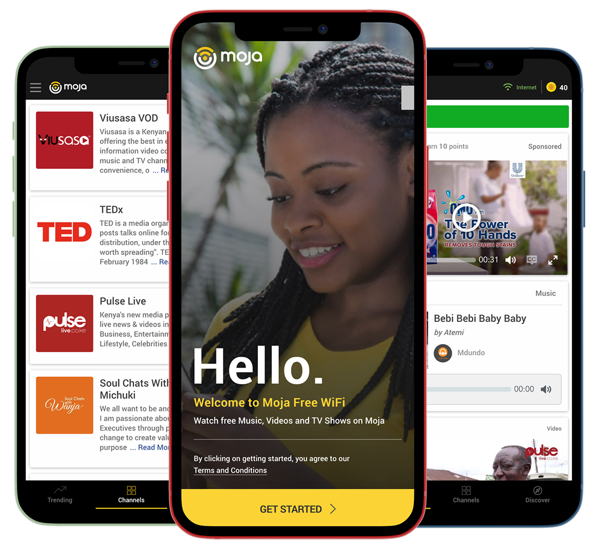
After a couple of iterations for the onboarding, we settled on offering a brief explanation about Moja points and gave users multiple options to earn points quickly.
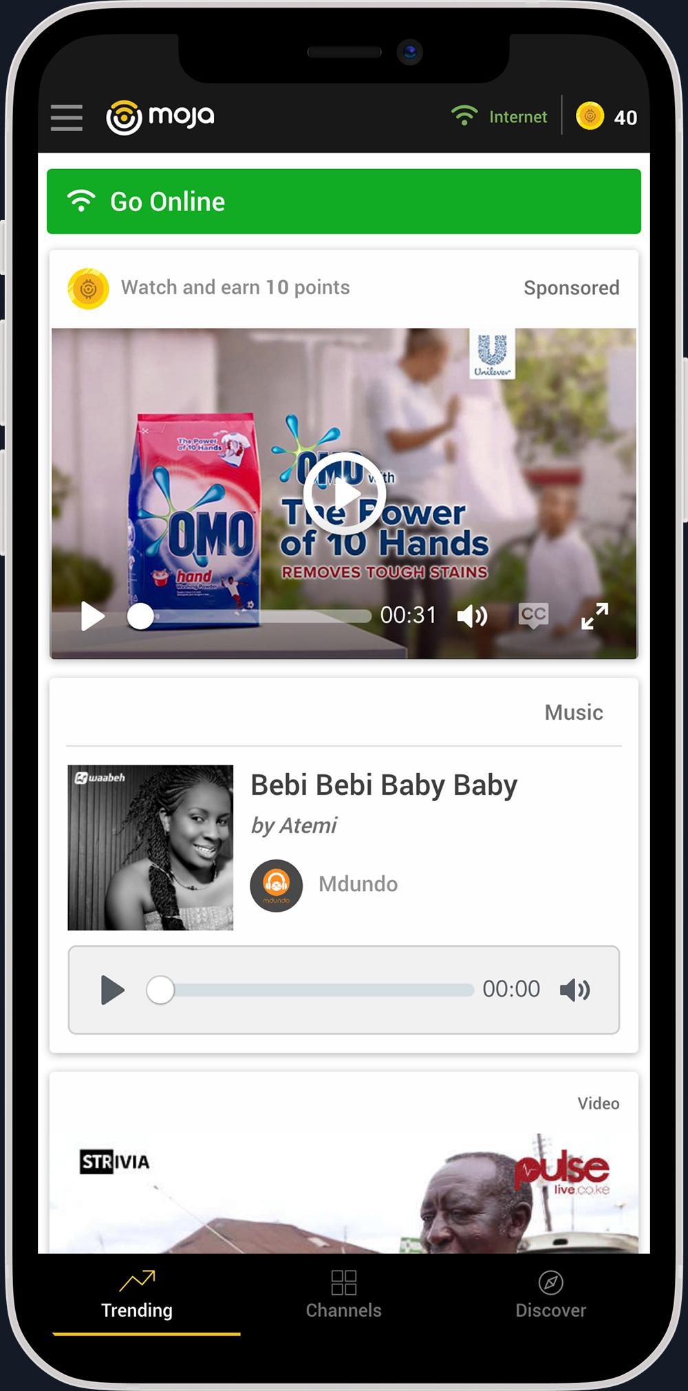
Once onboarding was done, users could view their point balance, spend their points to go online, and earn more points by interacting with content from our business partners.
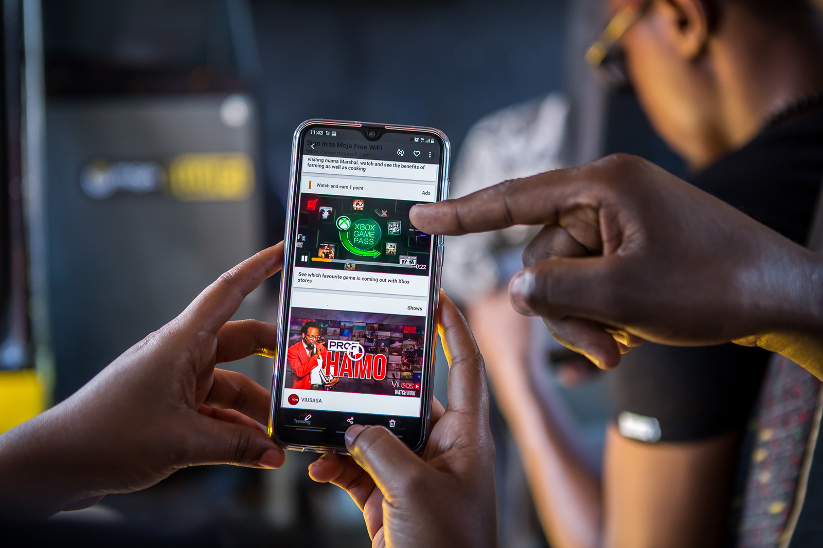
We designed different card layouts for different types of content. This provided a clean and beautiful way for users to scroll and discover content.
The Business Features
As our user numbers continued to grow each week, BRCK needed to increase its revenues on Moja. To enable this, the Moja Business department was formed.
As the product lead and designer in the Moja Business team, I focused on designing and building new features that would bring extra revenue.
To do this, we had to think beyond our corporate clients and focus on our user base.
Adding Businesses to Moja
After talking to a number of our users, we realized that some would like their small shops and businesses to be listed on Moja. Many of these businesses were too small and informal to be effectively marketed on Google, Instagram or Facebook.
To tap this market, the business team focused on creating a marketplace (Moja Soko) where the first feature was adding business listings for free. Later these businesses would be able to promote their business or products on Moja for a small daily/weekly fee.
The First Steps
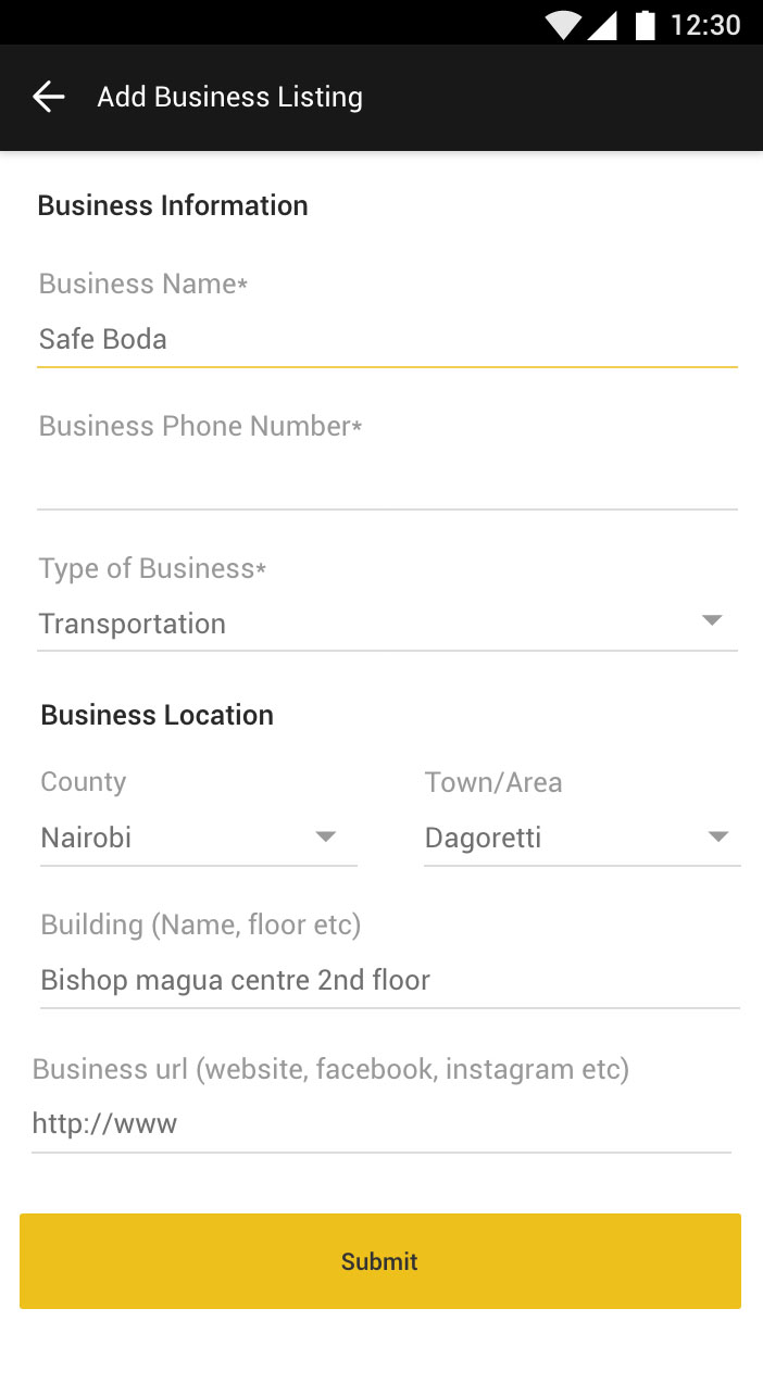
For the first iteration of the add business listing feature, I added all the fields on one page. The idea was a user would quickly fill the fields and move on. But this presented several problems:
- It created a lot of uncertainty among users. After we distilled the feedback, it became clear that people wanted to understand why they needed to fill certain fields even though it seemed straightforward to us. e.g., why do we need their business numbers or URLs?
- It looked a bit intimidating, especially to our not so tech-savvy users, which discouraged them from adding a listing.
- Adding more fields as the need arises would have been a challenge if the design was to remain the same.
Getting There
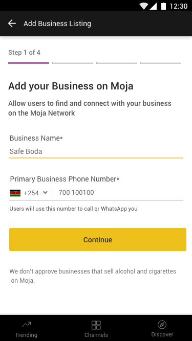
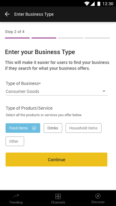
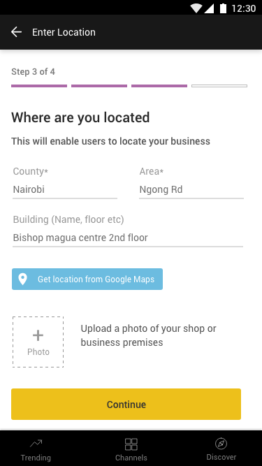
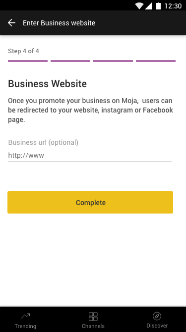
To make it clearer, I decided to separate it into multiple steps. Each step had clear explanations of why they needed to fill the fields.
This also allowed us to add extra fields and functionality or move things around quickly as we iterated.
The feedback was great, and a key takeaway from this was that more steps could be better than less when trying to complete a task as long as users can easily understand what is going on.
Points for Food
At the start of the covid-19 pandemic, many people lost their jobs and many of our users who lived in less than $2 a day were unable to buy food for their family.
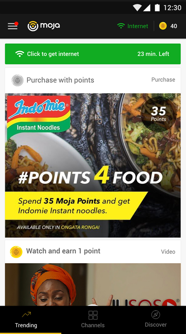
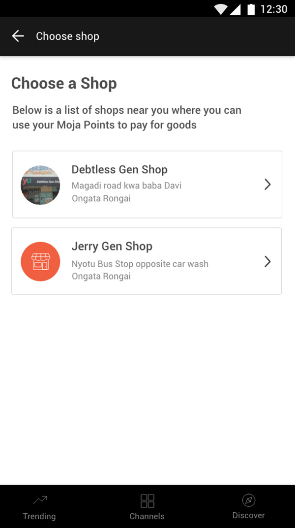
In response to this, different teams at BRCK came together to quickly build a test feature that enabled our users to use their points to buy food from one of our partners.
After running a live test for a couple of days and getting lots of feedback, the business team was charged with building out a more robust feature.
This feature had to achieve the following user goals:
- Users should be able to choose the selected shops in their area. This included showing them the name and photo.
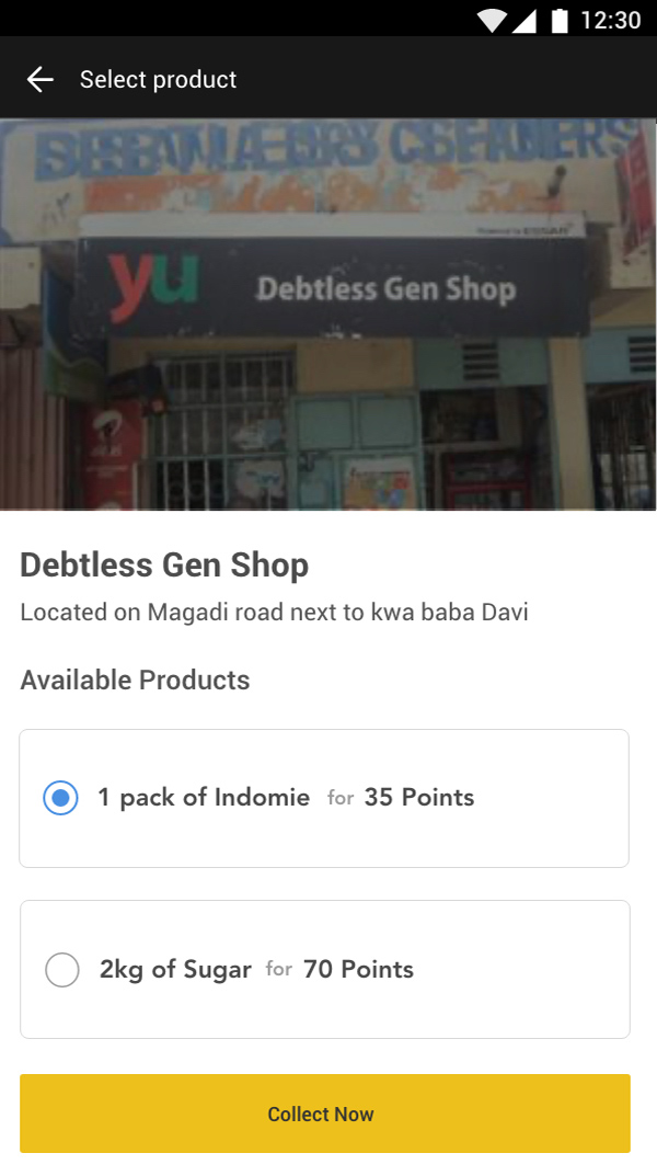
- They should be able to choose the goods that were in stock.
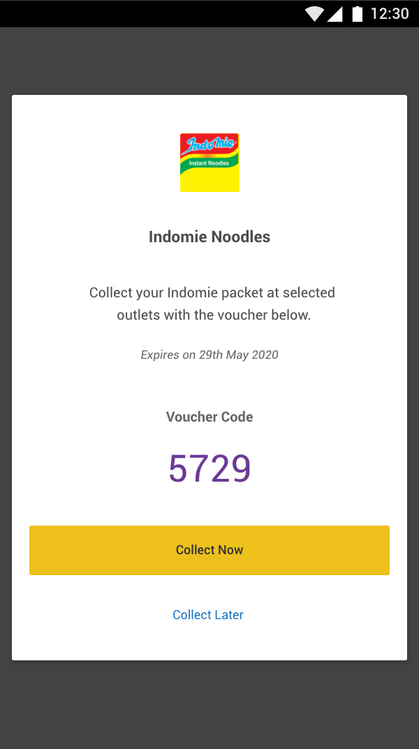
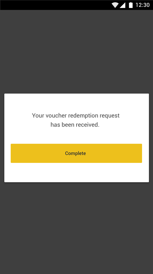
- They should receive a voucher code that they can use while at the shop or use later at their convenience.
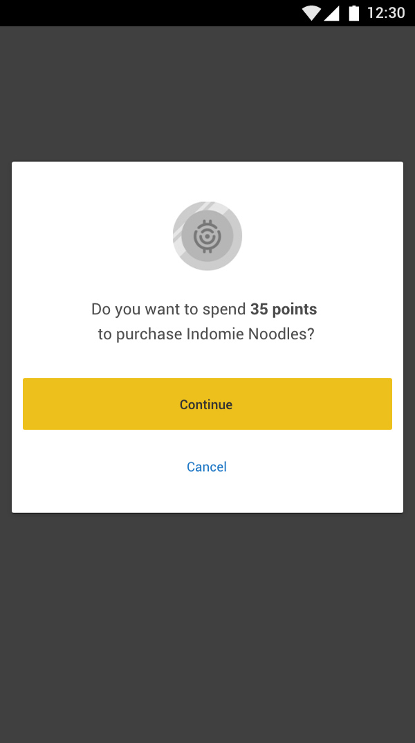
Because of the rapid pace of getting this feature out, I quickly created these mockups with a few small iterations and handed them to the engineers.
Conclusion
With lots of iterations based on feedback, the redesign achieved the desired goals and saw a significant spike in user numbers across the network.
After the lockdown due to the Covid-19 pandemic, we experienced a massive drop in user numbers because users could not access Moja WiFi. As a result, many features, including the Business listing and points for food, had to be put on hold and ended up not getting a wider release as expected.
A key takeaway from this entire redesign process is you don’t have to have a perfect product at launch. But with a deep commitment to listening to users and continuously iterating based on feedback, you could build a product with a fantastic user experience.

